ZUS Coffee
ZUS Coffee
Mobile App
2025
UI/UX Designer
🧠 Context & Problem
ZUS Coffee has quickly grown into one of Malaysia’s most prominent local coffee brands, with a strong digital presence and a dedicated mobile app for ordering, rewards, and delivery.
However, from a user experience standpoint, the app presented a number of friction points:
Cumbersome navigation made it hard for users to complete quick orders.
The ordering process lacked clarity, especially for customization and pickup options.
The loyalty and rewards experience felt buried, despite being a key driver of repeat purchases.
Visually, the interface didn’t reflect the premium-yet-accessible identity ZUS aims for.
I decided to take on this redesign as a personal project to streamline the experience, improve visual consistency, and enhance engagement through better UX flows.
🔍 Research & Insights
To inform the redesign, I studied mobile ordering experiences from both local and global players in the coffee and food-tech space.
Apps analyzed:
Starbucks – Renowned for their intuitive mobile order-ahead experience and rewards visibility.
Tealive – A regional competitor offering drink customizations and voucher-based rewards.
Flash Coffee – Focused on speed, with a sleek, modern app optimized for grab-and-go users.
Key Learnings:
Users expect to place an order in under 2 minutes, especially repeat users.
Top-performing apps guide users through size, sweetness, add-ons, and temperature without overwhelming them.
Users are more likely to return if they can see their progress and understand how rewards are earned.
Clear indicators of nearby branches and pickup options influence ordering decisions.
These insights became the foundation for reimagining the ZUS app experience.

🧪 Design Process
The redesign journey focused on simplifying the ordering process, improving discoverability of features, and modernizing the visual tone of the app.
Wireframes & Interaction Design
Built wireframes for all major flows including home, drink detail, cart, and rewards.
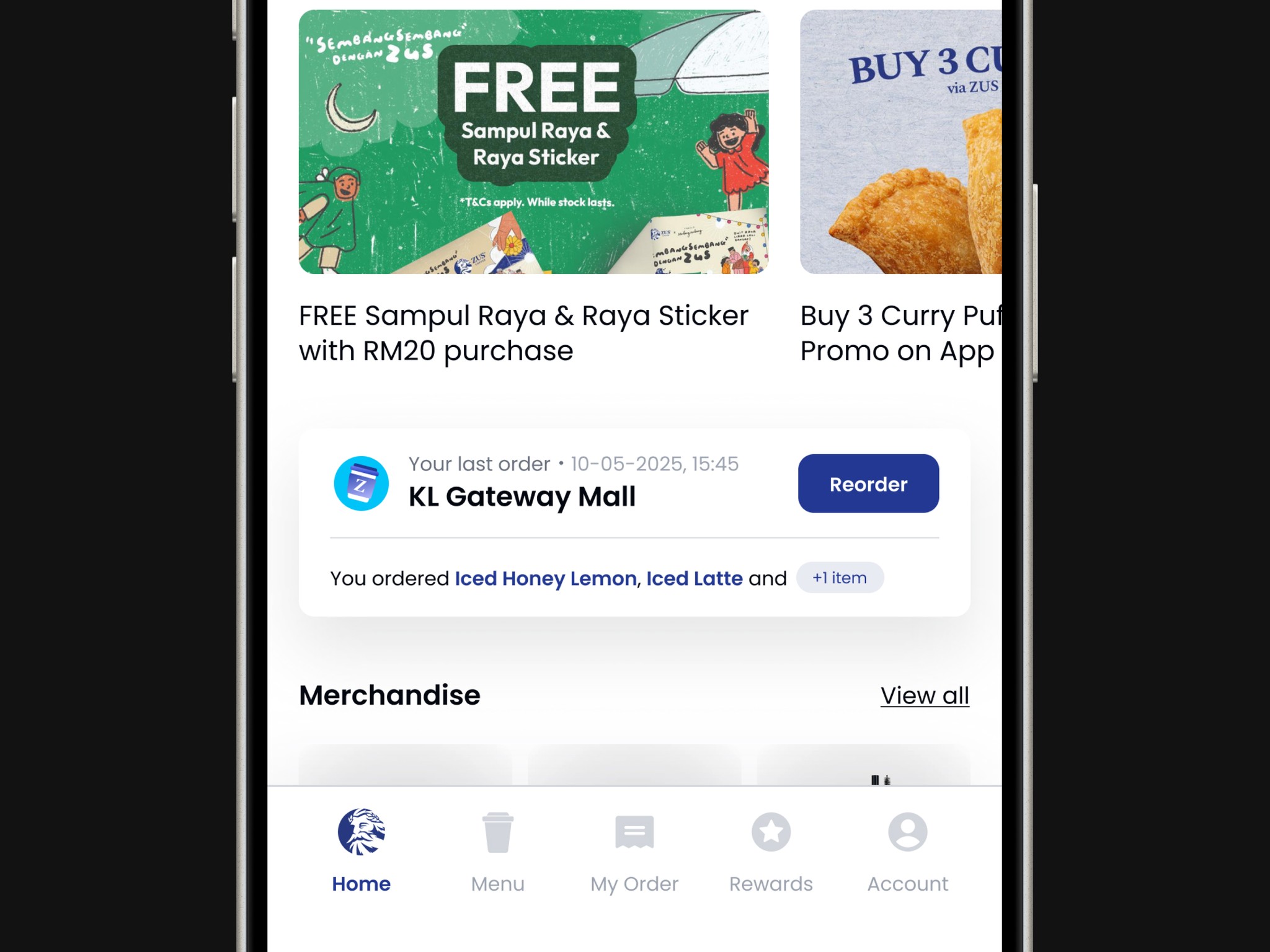
Introduced “Quick Reorder” and personalized recommendations on the home screen.
Rearranged the information on the homepage and reduced the size of the ads that took up almost half of the screen.
Visual Design
Updated the visual style with cleaner typography, more consistent spacing, and a neutral-dark theme that highlights imagery and buttons.
Repositioned loyalty tracking to be visible from the home screen.
Designed a more cohesive iconography system that aligns with the brand’s energetic yet premium tone.


🔑 Key Features
The redesign introduced thoughtful changes aimed at making the ZUS Coffee app faster, more enjoyable, and more rewarding to use.
☕ Smart Ordering Experience
Users can now:
Quickly access favorite drinks and recent orders
Customize drinks in a guided, intuitive flow
Switch between pickup and delivery seamlessly
🎁 Loyalty & Rewards in Focus
The new layout brings:
A rewards tracker directly to the home screen
Visual prompts to show how many more purchases are needed to earn a free drink
Easier redemption during checkout
📍 Location-Based Discovery
Nearby outlets are now highlighted with:
Clear pickup time estimates
Visual maps with operating hours
Auto-location detection on app launch
✨ Visual Refresh with Purpose
Modernized color palette and spacing improve readability and interaction clarity
Icons and illustrations give the app a friendlier, more polished feel
Transitions and micro-interactions add a premium touch
